TYPEFACE
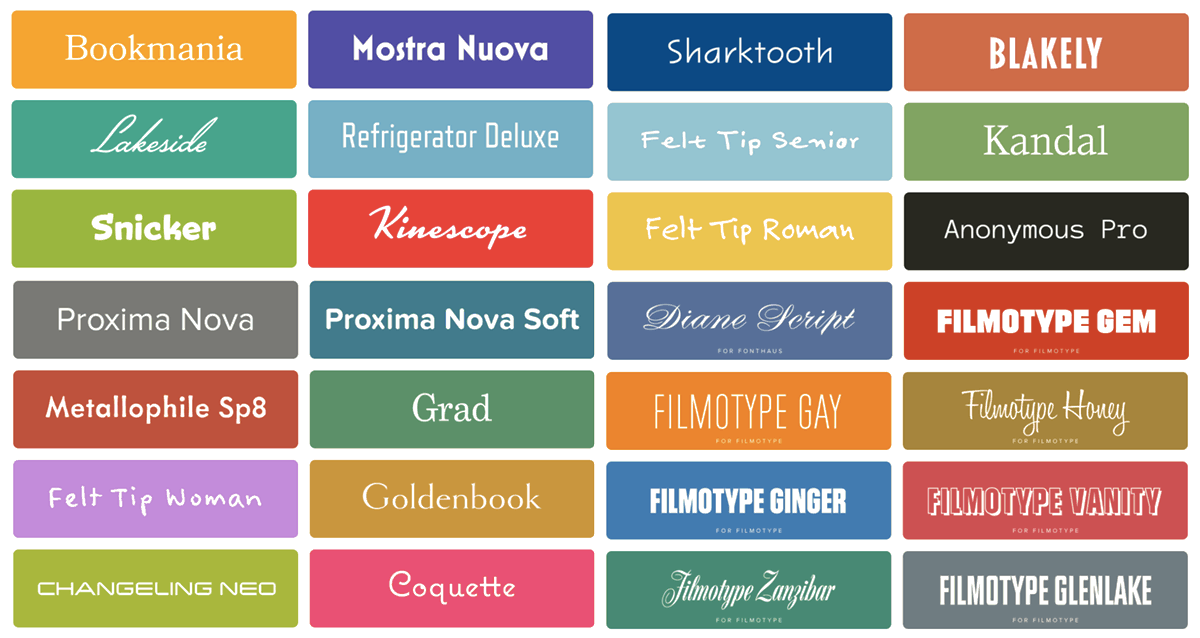
"In typography, a typeface (also known as font family) is a set of one or more fonts each composed of glyphs that share common design features. Each font of a typeface has a specific weight, style, condensation, width, slant, italicization, ornamentation, and designer or foundry (and formerly size, in metal fonts)."
- Wikipedia, https://en.wikipedia.org/wiki/Typeface
The simplest example of a typeface is your own handwriting - it is a 'design', where all letters are written in a similar fashion or follow some set of rules.

There is example of my own 'typeface'. As you see, my handwriting is quite irregular; straight lines are not always straight (b), (e) is very similar to (c). My (E) looks like number three, and I write (B) from bottom, unlike others who write it from the top.

RESEARCH

Just as it was for all my projects I had to follow some steps before even beginning to do the actual work.
Firstly, I had to introduce myself to the concept of typeface and its differences with font. Then I have started my research. I have decided to stick with a secondary researching - using the internet - as it would be the most reliable and efficient method. It is so because the internet provides enormous amount of typefaces as result. Thanks to the internet I was able to access different sources and even used Metaflop to try creating a typeface.


Because of the Metaflop I have been able to understand different parameters of a font. such as superness or aperture. Changing one of those things can dramatically change the feeling accompanying a font. It can easily make letter look silly or more stylised.

In my opinion gothic typefaces are quite unusual. All of them look similar to each other with their fancy lines and additional 'leaves' and lines. I have tried few times to recreate them, however, it was not an easy task with normal pen - calligraphy requires different tools and more experience. Because of that I have decided to not try to recreate graphic typeface and make it into my own.
This typeface is very stylised as well. However, it gives different feeling that the previous one. There we can see that more of author's personality has been put into the writing. Author has also decided to use 3 tones of green instead of plain black. In addition, part of all letters has been erased at the same height making this typeface more like a graffiti on a wall.


I like this typeface much more. I like how irregular it is - letters have different cap and bar height as well as width. Because of it, this typeface looks very personal.

Another irregular typeface. Unlike the previous one this one follows more rules for letters q, g and y, making them more similar.
INITIAL IDEAS


There I have written multiple letters e and b with 3 pens in order to find best style. I have also thought of a music typeface although I am not into music at all. The idea was to make letter as similar to music notes as possible.
There I have checked how changing angle can affect my letters.
I like curves and width here.
I think that my f looks better this way.
There I have played with letters. I wanted to use least lines possible to create letters. Above you see A (V upside down), B (3), C (left bracket), D (right bracket), E (three lines), F (two lines), G (it was problematic to think of so I have simply used 3/4 of a circle) I (line), J (well, it is simply J), K (<), L (same like J - simply L).
I have seen similar design on a poster.
There I have tested different variations of a letter a. I think that second option is the best. For this one I have used rotated number 6 from Serif Gothic Bold.
I do not like this design, despite
using it my handwriting, because
of its similarity to the letter Q.
Another design related to music, where capital letter S is supposed to look like a harp. I meant to design B like an instrument but it was a failure - you cannot tell the instrument or even that it is letter B.
Multiple curves make this letter
hard to write.


S is very complicated,
On the other hand, letters
like E, F and L are easier
to write because they use
perpendicular straight lines only.
There I have came up with another concept - using mathematical symbols and numbers instead of letters.
It is a good idea as some people DO use numbers instead of letters.
There I have been experimenting with different bar heights.
Simple concept for capital letters similar to the third typeface I have researched.
For this concept I have decided to write outside the actual letters.
Different letters A. First one is simply taken from the first typeface I have researched.
There I wanted to follow a simple pattern for all letters. Unfortunately not all letters looked good.
My handwriting.
FINAL PRODUCT & EVALUATION

All letters.

Chosen characters.
I have decided to choose my actual handwriting as final typeface for this project. I did so, because look of those characters is very personal, close to me, as they naturally come up when I write. I believe that forced idea are not good and give no satisfaction. On the other hand ideas that come up naturally are total opposite of what I have just written. I have selected those characters instead of others, as they come from my full name - something even more natural ang general for me.
I think that I did very good in this project as I have a deep research and followed it with a range of initial ideas and sketches. This project teached me that I need to be patient while working, as fast-paced work is inaccurate; I had to scrap many ideas and texts that were simply not of a good quality - during the first of three lessons I wanted to do as much as I could, what resulted in bad work. For next two lessons I worked much slower but my work was better, in my opinion atleast.